
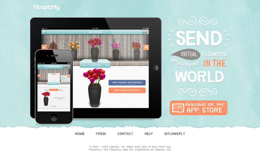
Great looking single page iPad/iPhone app site. Custom lettering FTW too! I love it, that block of text on the right side is immaculate. Down to the custom lettered “app store” button. I’m not entirely sure why there’s a “home” button on a single page app, but maybe there’s plans for subpages down the road. Overall though, lovely design here that does it’s job well.


Fitts’s Law: Why the Easy Button Wins
Large, close targets are faster to hit than small, distant ones, that’s Fitts’s Law. A look at the 1954 rule behind buttons, prime and magic pixels, thumb zones, and dark patterns.


As much as I like the design and overall look & feel, it leaves me questioning the gallery approval process you use to list sites on here.
This example isn’t responsive, ok not the be all and end all I suppose. The links in the nav (press, contact, help) point to email addresses (poor usability) and the Twitter page has a completely different look and feel to the website design.
It’s simple James. I liked it, so it got listed in the gallery!
I really really appreciate you taking the time to comment too man! I agree with you on the nav items opening email address that drives me crazy, but I think overall the things I pointed out in my post about the design explain why I like it. I love that type work a lot.