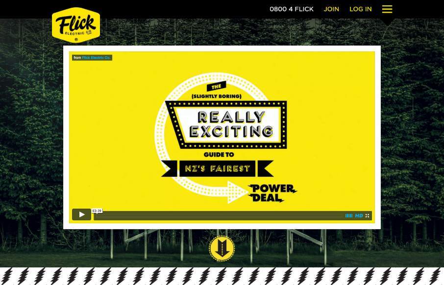
This Flick Electric site out of New Zealand, done by Traverse Digital in Wellington, is an example of breaking through barriers in an industry that is classically resistant to change (at least in the design sense). Flick looks to be a power / electric company that challenges the norm for the industry in their business model – so it’s appropriate that their site do the same. Love the bold yellow, black and white that’s accented by muted colors throughout the site – the flat illustration and icon work – and the SVG work, especially on the Details page. I wish our local power company would start thinking about being bolder in their design offering (if not other offerings too…).


0 Comments
Trackbacks/Pingbacks