
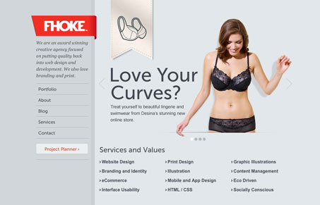
The fhoke.com website is a well balanced experience. I dig the fixed sidebar navigation area and the strong red color used sparingly makes things really stand out well. In our screen cast review Giovanni and I both really liked this design. The thing that really cinches is that each page has had some attention paid to it. Each page is different enough, yet cohesively designed to keep me clicking.




Wow. Thanks for the writeup guys a great start to the morning. The name as always gets a bit of discussion going but you were right. Pronounced as ‘folk’.
I agree that Fhoke’s website is beautiful, but one of the most remarkable things about them is the consistency of the work they produce for others.
We have just been searching high & low for the right design firm to design, build & brand a large, complex & feature rich start-up website. Being thorough (and fussy), we checked all the sites that Fhoke built, and found that extraordinarily from the large & feature-rich sites to one-page sites, the quality of their design, code and usability remained high.
We have just decided to hire their services. As clients, this consistency reassured us that no request would be too small or too big and that whatever we throw at them they will deliver.
Anyway, as I stumbled across this review here, I thought that a client’s viewpoint may be beneficial to Unmatched Style designer community.