fflick.com

fflickcom

Submitted by Marc Hemeon, @hemeon. Designer.

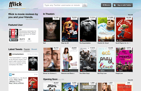
Really a very cool idea here! The design is very well done too IMHO, that’s a lot of information to get across on one screen and it’s done so that the page is very quickly taken in. Perhaps it’s just the use of the movie posters that allows that to happen… The design is tight and not too crowded, that’s not easy to do.

0 Comments

Submit a Comment

Your email address will not be published. Required fields are marked *

News & Articles

Sign-Up: Enhancing Conversions through good UX

Sign-Up: Enhancing Conversions through good UX

Optimize your website’s sign-up process by focusing on clarity, ease, and user mindset. Clearly explain the purpose, benefits, and steps, and use social proof to build trust and drive conversions.

The Essential Guide to Getting Started on Freelance Writing

The Essential Guide to Getting Started on Freelance Writing

Explore the lucrative and fulfilling world of freelance writing with our essential guide. Learn about specialties like blogging, social media, article, and technical writing. Build a portfolio, find work, set up your business, and discover the potential earnings. Embrace the freedom of working from home and follow tips for success in your dream career.