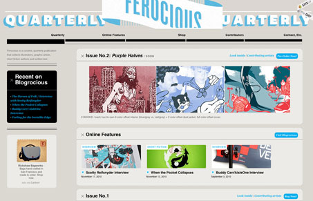
Fe.rocious.com has great content. The are just now working on their second issue but they have some really nice art and literature for us to poke through. The site uses a nice combination of soft blue, white, and tan to create a ‘screen pressed’ feel that lends itself nicely to their product. The site, though nice as separate elements, lacks a distinct visual hierarchy on many of its pages. This causes that ‘ping-ponging’ effect where your eyes jump around the page constantly and never settle down on something to read or look at, which is because each section of the page is so full of great looking design & illustration. It didn’t stop me from poking around and finding some great art so obviously its not too much of a problem. However, adding some space for the eye to rest or content that is unequivocally the focal point of the page would help. The product looks great, though. And I think I might just get the first issue.


Thanks for the words guys! Appreciate the feedback and criticism ten fold. This is great timing for us cause we are up to our eyes in a big re-design of the site. Here’s a quick sneakpeak on dribbble – – http://frcio.us/3ZuP
Great stuff Nate! Keep us in the loop when you relaunch we’ll want to review it for sure!