
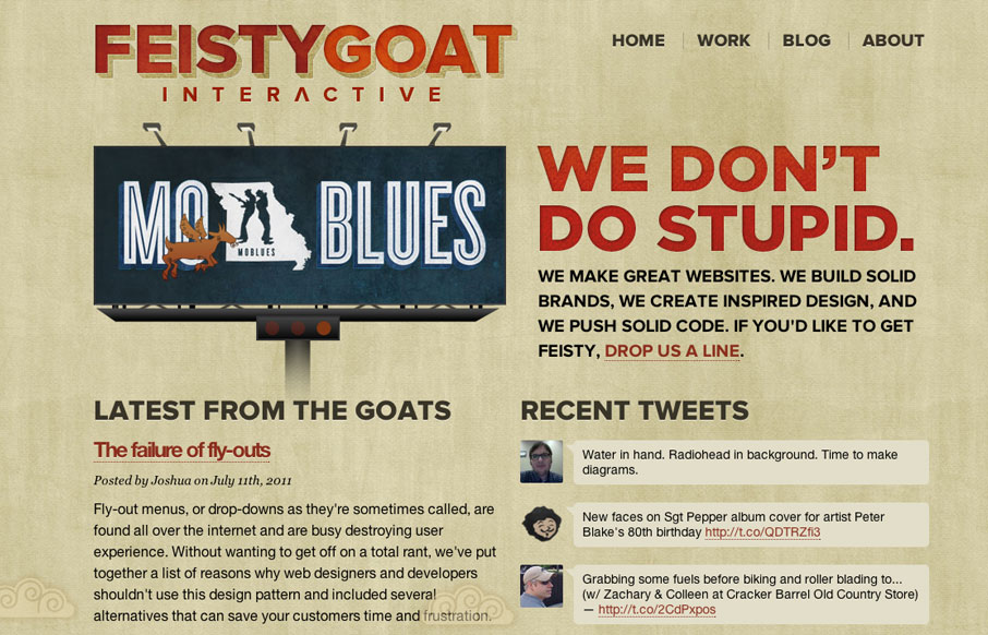
I love the bold two column layout of the Feisty Goat website. The animations are fun and the overall tone is indeed feisty. I really like that they have thought out their brand’s tone so fully and push it with the copy and everything. In this case it really helps define the team behind the company. Makes them look & sound really fun.


Fitts’s Law: Why the Easy Button Wins
Large, close targets are faster to hit than small, distant ones, that’s Fitts’s Law. A look at the 1954 rule behind buttons, prime and magic pixels, thumb zones, and dark patterns.


I like the vibe of this site, but I wish the type was a little more refined. On the work page just a little bit of spacing between elements and attention to detail would take it up a notch.
Agreed, the vertical rhythm of the page is a bit tight. But I liked the vibe most of all.