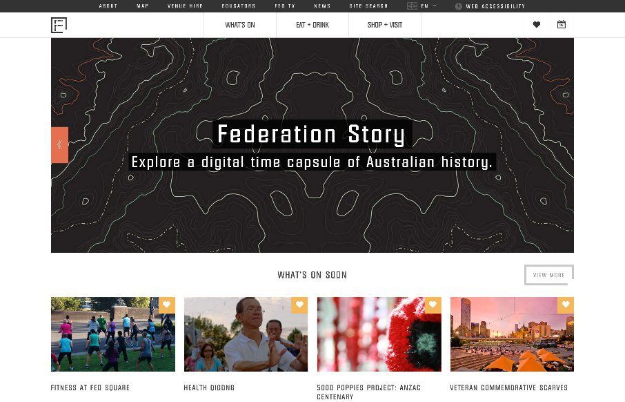
Federation Square

http://fedsquare.com/

I like the blocky-ness to this layout. Though at first it comes off as little cluttery looking, I find myself liking the way the navigation is done. The small black line with standard nav items and then the larger more central nav items under that to stand out more is a nice way to accomplish putting a lot of nav in one place. I also like what they’ve done with the logo, mouse over it to get the “home” link. Cool.

From the Designer: Federation Square is the heart and soul of Melbourne. A modern piazza, home to major cultural attractions, world-class events, tourism experiences, restaurants, bars and specialty stores.

Submitted by: Frank Digital Sydney & Melbourne
Twitter: @frank_digital
Role: Designer
Designer URL: http://www.frankdigital.com.au/


0 Comments

Submit a Comment

Your email address will not be published. Required fields are marked *

News & Articles

Looking Fast: The Art of Website Speed Perception

Looking Fast: The Art of Website Speed Perception

In the web world, technical speed and user perception matter. By improving design for a faster appearance, you boost conversions and stand out online. Speed isn’t just loading time; it’s perception.

Designing for Errors: Creating User-Friendly Contingency Plans

Designing for Errors: Creating User-Friendly Contingency Plans

Contingency Design hinges on empathy, understanding user frustration, and transforming errors into positive impressions. By embracing these principles, you enhance user experiences, retain customers, and boost revenue in the competitive digital landscap