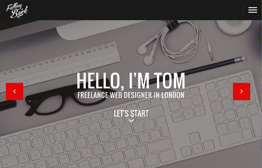
Pretty different vibe for the layout on the FallingBrick website. I find the placement of the “hamburger” nav item real interesting. I’d be super curious to see what kind of influence placing that in the center of the “header” area would have on it’s discoverability. Overall the way you interact with the sections of this site is cool, it’s really one long scrolling site, but broken up into discreet sections. Pretty cool.


The Call to Action, Revisited
The Call to Action hasn’t changed in a decade, but the bar has. A fresh look at prominence, copy, mobile tap targets, and accessibility, with lessons from three major design systems.


0 Comments