Beautiful website design with some really great detail work. I love the animated clouds under the header and the navigation/header shape is cool looking too. The sub pages are all designed and have something unique about them to differentiate from the other pages. The portfolio page is probably my favorite part, I love the large images and different sizes all in action on the same page. The contact form is really great too, going with the ad-libs style form layout makes the site really stand out to me when I think about it after i’ve left it for a while.


This is a really beautiful site with a high degree of polish and attention to detail.
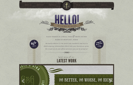
However, I feel like I need to write a dissenting opinion on the color choices. The beiges and browns are very earthy and organic and this is reinforced by the subtle grunge/worn textures and the rough hand-stitched borders. It looks bespoke, approachable and awesome. Then purple comes along and rains on the parade of awesomeness.
Purple is an artificial color. It has the reputation as the color of royalty because only the ultra-rich aristocrat types could afford to wear it back in the day. Now it’s mainly associated with luxury brands like Crown Royal. From a psychological perspective I think that the purple is clashing with the otherwise “proletarian” mood of the design.
Personally, I’d like to see rust red in place of purple for the two “seals” on the left and the right, maybe go with black on the “Hello!” title and set the “it’s so nice to see you” ribbon in rust red as well with white/beige type.