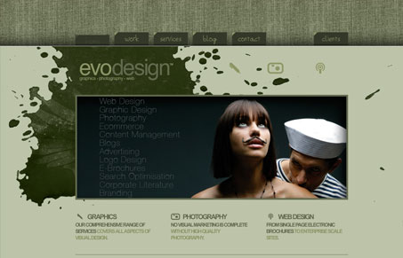
The re-design of the site happened in November of last year, but over time the design has matured and content has grown.
The aim of the site is clearly to demo work from EVODESIGN, discuss the range of services as well as present information and content pertaining to the industry.
The objective was to show that monochrome palettes can work nicely and to try and limit, where possible, to XHTML and CSS. Not because we don’t love JS and Flash – but just so we can show clients you can achieve nice results without relying on those things.
I have to agree with the above statement, I really like the fact that this design is scaled back and simple. It does everything it needs to do with out fancy scrolling and lightbox effects. I like the monochrome coloring and the big background image projects a nice effect, especially on the sub pages where the fixed background image is even more obvious to me.


0 Comments