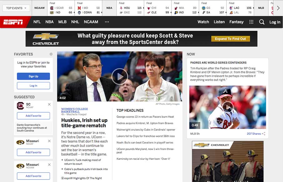
In the US today it is the official Opening Day of baseball, and tonight the championship game of men’s college basketball – so appropriately we look at the 20th Anniversary redesign of a site that is now ubiquitous with sports in the US: ESPN.go.com
With as many or more storied published daily as a normal “newspaper”, I would imagine the information architecture and wireframes for this must have taken a long time – but as they describe in an article about the website overhaul – then new ESPN site is seeking to put more personalized sports information at their users fingertips – 61% of those 94 million monthly users that access the site via mobile especially.
In this aspect, how they’ve woven design and user experience is pretty incredible – and it’s a heck of a lot faster than I remember it (on desktop and mobile). And while I could have spent a while going through the details of the design – the ones that really stick out are:
1 – The emphasis on top events and scores at the header of the page – so you can take a quick look under the table while at dinner, not getting lost in the sea of sports info.
2 – 3 Column layout (Home)- we’ve been testing something similar for the UMS redesign – but love the ability here to have personalized info sticky on the left – headlines semi-sticky in the middle – but the quick bursts of “Now” videos and stories on the right, with sharing ability for “did you see that” moments to friends.
3 – The mega drop down menus for top sports – clean and well organized for direct team or info access (if I remember, you used to have to click through to the sport, then figure out on a landing page where you wanted to go from there).
4 – 2 Column layout (Story Detail Pages) & Infinite scrolling – if you are a sports fan – there is never enough – but it also makes this site quicker, which was a drain on the last few versions of the site. Love the ability on left to use it as a story menu of sorts, to quick scan other articles – then there is a vertical story length indicator line on the left that corresponds with you story so you don’t get totally lost.
5 – Changing menu based on where you are – if you go to a major sub-page, like NCAAM and scroll down, the main menu is hidden by a sub-menu for NCAAM specifically. As you scroll back up – the main menu comes back, with the idea that you may have read all you want to in this area, and are ready to move on. This is probably the most ingenious part of the re-design – having a secondary sticky menu without taking up more room on the page – giving more real estate to content – love this.
6 – No Footer – love this too. All the normal footer info is in the 9 dotted cube drop down in the main nav – allowing for infinite scrolling that is really infinite.
Of the site – like how Paul Allen released the 1995 wireframes for the site that his company, Starwave… yep, did for ESPN Sports Zone:
Happy 20 @espn.com! My co Starwave started the site in ’95 & its reinvented sports info since! (thx M Slade/team) pic.twitter.com/qJdWsNAS9e
— Paul Allen (@PaulGAllen) April 2, 2015


The no footer look is fresh