Submitted by: Iain Harper @iainharper
Role: Director
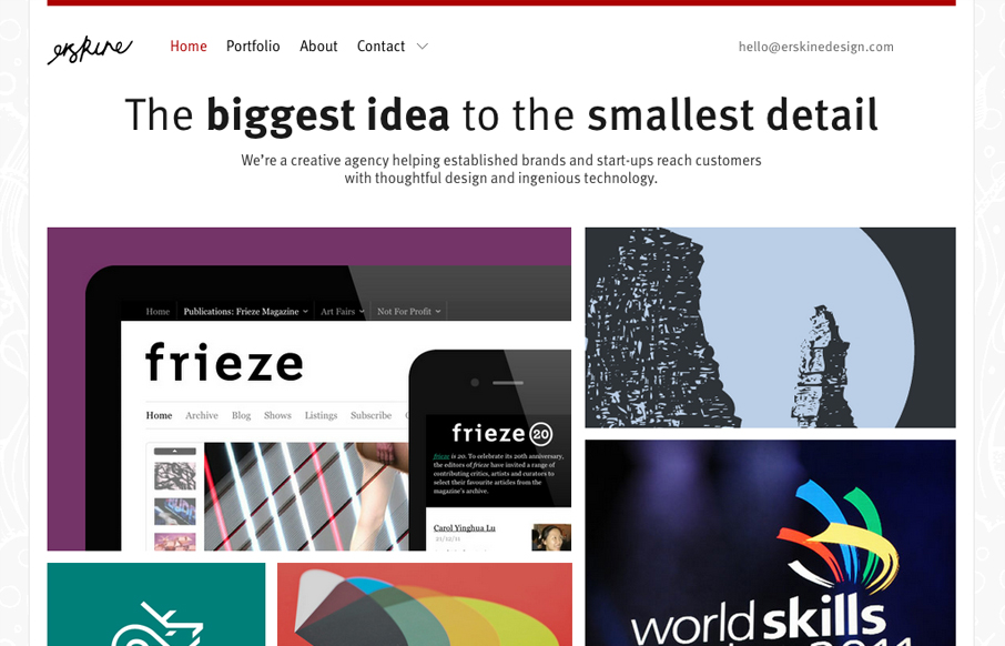
Working on your own projects is often the hardest and this was no exception. After three long years we needed a new site to reflect the evolution of our agency. We took a fairly pragmatic approach, trying to demonstrate some new tricks and techniques without showing off.
This new(ish) design for the Erskine website is a nice example of cool pragmatic work. It really is an understated design. Solid from tip to toe and also full of nice surprise pieces like the little bird in the footer and the contact slide down section, which I really like most of all.
They have a pretty thorough write up about the design process on their blog too, you should check it out.
We started with a completely fluid layout, adding CSS media queries on top in a mobile first approach. Older browsers such as IE6 get the fluid layout without media queries, but we add an extra rule applying a fixed width to the content wrapper. EM-based media queries ensure that breakpoints are appropriate for the layout regardless of the font size.


0 Comments