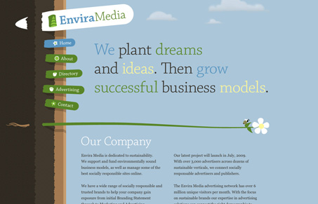
This is really a fun website. The illustration is unique and fun and I like the typography too. The sub pages kind of don’t hold together being that they just mirror the home page.
Looking Fast: The Art of Website Speed Perception
In the web world, technical speed and user perception matter. By improving design for a faster appearance, you boost conversions and stand out online. Speed isn’t just loading time; it’s perception.


I like this site over all however one thing that is bugging me is the clouds. It looks like the site is basically sideways. The brown on the left is soil and all of the visuals and links on the left are meant to be sticking out of the soil. If you look at it that way, as if the brown stuff on the left is actually the ground, then the clouds are messed up. That probably seems nit picky but it is something that threw me off of the overall feel. It was tricky to understand at first what exactly was going on.
Overall I think the site is strong.
Great looking site. Very cool design style. Nice attention to detail. One thing I wish was better, the Contact form. All fields are required, but there’s nothing to denote that. It uses oldschool javascript alerts when I get the field wrong. This should be an ajax form.
@Alan I totally didn’t see that until you pointed it out, yeah why aren’t the clouds sideways?
@john “old school” I like that, I think i’ll use that to describe a javascript dialog on submission. You’re right nowadays that should totally be inline error handling.
It is a strong looking design for sure.
Great great great design. Interesting decision to put the ground sideways, the identity is really good.
The only thing I don’t like is a minor issue, but the different positions on the trees make it hard for me to read everything just easily. I have to “search” for the information, as it isn’t linearly displayed. It’s a minor problem as I said, the site looks fantastic.