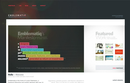
I really love the portfolio layout of this website. Nice big(ish) thumbnails that lead to a full screen shot and some background info on the project, all done with a bit of nice clean design style. I do feel like there’s too much white space between the content section and the right sidebar section, it really show’s itself on the home page, where the smaller details seem out of place when put up against the whitespace void. Overall this design is quite good, I really spent some time looking around on the site and all it’s content, so in the end it really engaged me.
Looking Fast: The Art of Website Speed Perception
In the web world, technical speed and user perception matter. By improving design for a faster appearance, you boost conversions and stand out online. Speed isn’t just loading time; it’s perception.


0 Comments