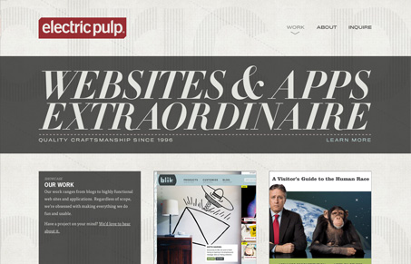
Love the new Electric Pulp site design. Having the home page basically be the portfolio is also a nice approach to simplicity. After all it’s what people come to your site for, why not just give it to them. This is a pretty smart example of a responsive design too.
The background is super sexy with the fixed transparent image over the scrolling background, very subtle and shows off a great eye for craftsmanship in the work. It’s one of the things i’ve always loved about these guys. Then the only other real page of the site is a long scrolling “about” section, full of stuff that gets you into who they are. The guided tour photo slideshow is fun and the copy is really witty and clear in informing you about their character.
I like it when a group like this really keeps it simple yet gives you so much at the same time. Superb work!


0 Comments