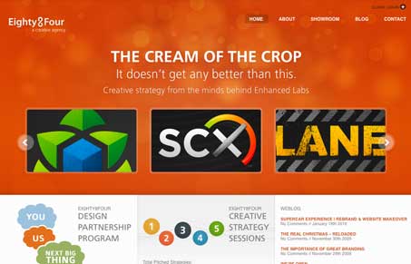
I love the nice airy yet solid feel of this site design. The orange is a nice choice as it goes well with the darker logo examples. The interactions are well placed and executed across this site. You’re in for a nice little surprise as you go page to page and discover the site changes up a bit for you, I particularly love the portfolio page. Pretty sweet design to work your way through on all the pages of this site. Great work here!
Looking Fast: The Art of Website Speed Perception
In the web world, technical speed and user perception matter. By improving design for a faster appearance, you boost conversions and stand out online. Speed isn’t just loading time; it’s perception.


Like the “distant lights through windshield effect”. Their photoshopper is very skilled. Nice logos, though the use of e-plastic styling makes a few of them look a bit dated. The ECM business card is a genius concept and extremely well executed.