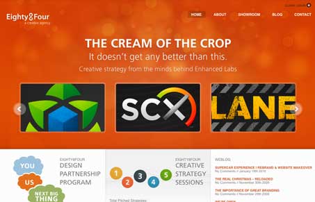
I love the nice airy yet solid feel of this site design. The orange is a nice choice as it goes well with the darker logo examples. The interactions are well placed and executed across this site. You’re in for a nice little surprise as you go page to page and discover the site changes up a bit for you, I particularly love the portfolio page. Pretty sweet design to work your way through on all the pages of this site. Great work here!
Glassmorphism: The Transparent Design Trend That Refuses to Fade
Glassmorphism brings transparency, depth, and light back into modern UI. Learn how this “frosted glass” design trend enhances hierarchy, focus, and atmosphere, plus how to implement it in CSS responsibly.


Like the “distant lights through windshield effect”. Their photoshopper is very skilled. Nice logos, though the use of e-plastic styling makes a few of them look a bit dated. The ECM business card is a genius concept and extremely well executed.