Submitted by Ben Kenny, @Ehh_what. Role: Designer & Developer.
Hi, i am a web developer / web designer based in the Midlands of England. I have recently updated my portfolio and hope its good enough to be listed on your website. Thanks.
Hey Ben, it sure is!
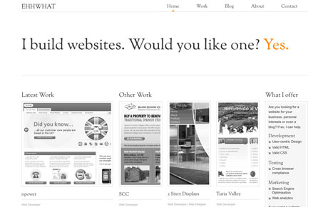
I really like the muted color scheme, with the strong orange for special placement. I like how the grid is used as well, the larger image for the latest work spot and the thinner ones next to it look nice. I always like a nice clean and minimal approach to a website design and you’ve done it well here.


Certainly unique in many ways. The black and white theme has been carefully utilised to provide a truly unique design. The font size could be larger though.
I find it uninviting. Like it’s playing at being a printed brochure for some corporation. I have little inclination to dig in and find out about it or why I should care.