Submitted by: Aleksandar Grkinic @ego_pop
Role: Designer
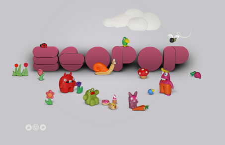
This is a simple and fun little site. There’s really not much going on but the home page has such an impact with the little illustrations and the horizontal parallax effect. It would be cool if there was some kind of interaction with the creatures. Some little animations could add even more fun and whimsy to it. As far as the rest of the site, it doesn’t really live up to the home page, and I feel like the type is a bit small and cramped. The home page is open, is would be nice for that to carry through. Aleksander is a really great designer, so it’s good to see lots of examples in his portfolio.


0 Comments