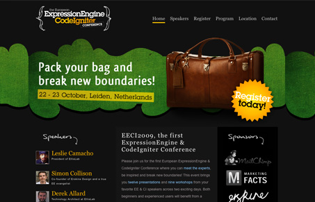
As conference websites go, this one is really simple and focuses heavily on the home page. I’m not overly wild about the black background but the overall layout is good and I can get almost all the information I need about the conference from this main page. I really like how all the pictures of the speakers are simply placed down the page like that, that’s something you don’t see very often and it makes for a good quick scan of the content of the conference, which is in reality the speakers.
Looking Fast: The Art of Website Speed Perception
In the web world, technical speed and user perception matter. By improving design for a faster appearance, you boost conversions and stand out online. Speed isn’t just loading time; it’s perception.


0 Comments