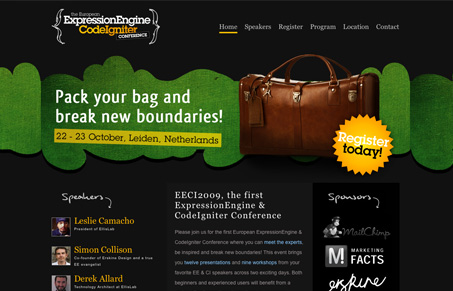
As conference websites go, this one is really simple and focuses heavily on the home page. I’m not overly wild about the black background but the overall layout is good and I can get almost all the information I need about the conference from this main page. I really like how all the pictures of the speakers are simply placed down the page like that, that’s something you don’t see very often and it makes for a good quick scan of the content of the conference, which is in reality the speakers.
Glassmorphism: The Transparent Design Trend That Refuses to Fade
Glassmorphism brings transparency, depth, and light back into modern UI. Learn how this “frosted glass” design trend enhances hierarchy, focus, and atmosphere, plus how to implement it in CSS responsibly.


0 Comments