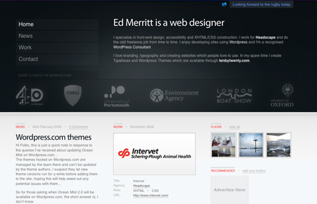
A very interesting site here. Visually it’s like two different sites put together, with the top and bottom halves looking so different. I kind of like this look, what do you think?
Glassmorphism: The Transparent Design Trend That Refuses to Fade
Glassmorphism brings transparency, depth, and light back into modern UI. Learn how this “frosted glass” design trend enhances hierarchy, focus, and atmosphere, plus how to implement it in CSS responsibly.


Nice overall. It would be nice if the Client logo’s on the front page had a hover affect and were clickable.
Yeah, I found myself wanting some interaction there too.