Submitted by Bob Galmarini, @ehousestudio
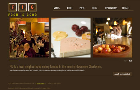
A website for a popular restaurant in Charleston, SC. You can also check out our website: www.ehousestudio.com.
Very nice looking, minimalistic restaurant website design. I love the colors and there’s a few really subtle use of javascript effects on this site. I think I like the navigation the best about this website.


I love this restaurant’s logo as well as the color palette used throughout the site. I also like the navigation and think it works quite well.
I wish there was more content on the home page. A feed from their blog maybe? Information about today’s specials? Or perhaps just more about the restaurant? I’d like to have a little bit more “meat” on the first page I see.
I also wish I could view the menus without downloading a PDF. I have to admit — these days, I don’t want to download anything. I want information accessible and at my fingertips, no waiting, no downloads. And I think I’m a pretty typical example of today’s Internet users with these types of demands.
I agree with you 100% on the PDF menu. I’d like to get this info really quick on my iPhone and downloading a PDF is just a roadblock.
@Jessica and @Gene
Thanks for the feedback on the site. There is a list of recent blog & press entries on the homepage. You can click on the news & press quick look tab at the bottom of the homepage.
The recent specials is a good idea, we have been using twitter to serve that via the blog. The client was looking for a easy way to update the menus since they change daily so they felt PDF would be easiest for them, but we may consider other options with more feedback. Thanks again..
Absolutely Aaron, this is what we’re all about at UMS, hopefully giving you some constructive feedback from time to time. Make the web better, yadda yadda…
There’s probably a good lesson to learn from Jessica for all of us on putting content behind fly-out type sections, i’m thinking she must have totally overlooked that on the home page. I wonder how many other people normally over look that?
I like the site. Brown is one of my favorite colors plus it is very inviting.