Submitted by Craig Fowler, @fowleryo. Designer.
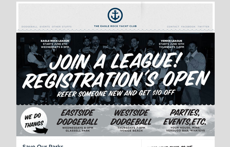
I love it. But then again, I designed it, sooo. The Eagle Rock Yacht Club is a dodgeball league, that’s also a social club, but also a way for us to give back to our community through donations and volunteer work. We’re also classy folks. We run a yacht club, for pete’s sake.
I love the look and feel of this design. I love the monochromatic color selection too. The type selection really conveys the fact that this is run by a local group of people who really enjoy this league, that’s really the greatest thing this design is doing – communicating the small but well run group activities (that’s the vibe i’m getting anyway). I’m not liking the fact that each page has the same big image area, either removing it from the sub pages or having the nav load to an anchor just above the content would really help. Overall great site to stumble across.


I dig the site. You could really improve the top menu and like the post above stated, you should change each subpage main image with either a smaller one or something lighter. The contract on some images kind of hurt the eyes. Sure they’ll look good on print, but online it’s not too easy to look at.