
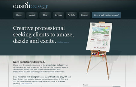
This is a bit more of a “traditional” style of web designer portfolio type website, and it’s done really well here. The navigation is clear and looks like buttons, no confusion there. It has a nice center piece on the home page with the easel and website sketch concept. I was a little let down on the portfolio, i’d like to know more about the work performed, but it does look nicely presented. Overall good colors and layout.


Fitts’s Law: Why the Easy Button Wins
Large, close targets are faster to hit than small, distant ones, that’s Fitts’s Law. A look at the 1954 rule behind buttons, prime and magic pixels, thumb zones, and dark patterns.


0 Comments