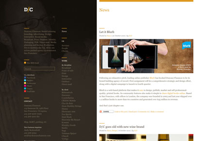
Duncanchannon.com has a fairly unconventional layout with all navigation and filtering on the left half of the site and the feeds and relevant content on the right. It works, though. I immediately understand what I am looking at. My one criticism is contrast. The value of the links and their background are too close for easy reading. Take, for instance the paragraph in the upper left-hand corner. Totally illegible. The bright spots of color for their social media links is beautifully set against the muted earthy background images (which are pretty funny if you take the time to reload the page over and over again to see them all). Other than the social media bullets their’s no real link hierarchy to speak of. But it does look lovely.
Its a WordPress site so the right side is the feed which can be filtered in numerous ways. Thats the best thing about the site. It’s really easy to drill down to the content you want to see. You can look by medium, client, or design. The format for all pages is identical so it feels less like moving between pages, probably a good transition choice for this site because of the layout. The type is set well in all the posts but, again with the low contrast, particularly in the orange links. I basically don’t even see them.
So, the layout is interesting and functional. The overall palette is warm and friendly and the type (when you can see it) is set nice and simple. All great qualities of a nice site.


0 Comments