
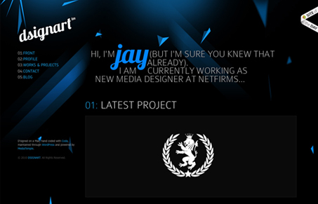
I really like how the blue/misc colored elements are tossed around the page. The typography is pretty tight too. The thing I love about this site is how the colors change up from page to page, it keeps me engaged even though it’s an incredibly simple design change. Good work there!




0 Comments