Amazingly simple design. I tend to like sites that are more minimal like these. This site has a pretty good portfolio too. One thing I always think about on site’s like these, is how much the main imagery effects the design. That big center picture is really the main part of the design, what does it look like as it changes. That could keep your site looking fresh in an easy to manage way.


The Call to Action, Revisited
The Call to Action hasn’t changed in a decade, but the bar has. A fresh look at prominence, copy, mobile tap targets, and accessibility, with lessons from three major design systems.


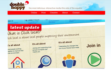
I don’t get this site. The spacing on all the elements is weird, there’s no copy and hardly any text on the home page. “This side of the equator”? Which side would that be?
The design looks really slapped together. It says ‘latest update’ on that huge image, but what is it? And why is there a ‘creative’ portfolio? Are the other portfolio pages not creative?
I do give him some credit, though, since he’s been designing websites since 1991.
I thought you’d dig the minimalist touch to this site. Agreeably that main image is quite large but I think it works.
It looks like they are calling video/motion graphics “creative” for the purpose of keeping the link name small or something.