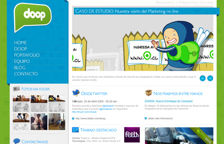
I like how the left navigation area is nicely pulled out visually from the rest of the site. The little details that are 3D or look like ribbons are nice on this site in that they seem to go along with the illustrative quality of all the other elements on the page. However, the main copy font is fairly small and too grey to be truly readable.
Looking Fast: The Art of Website Speed Perception
In the web world, technical speed and user perception matter. By improving design for a faster appearance, you boost conversions and stand out online. Speed isn’t just loading time; it’s perception.


0 Comments