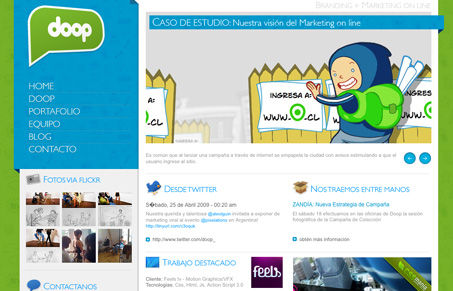
I like how the left navigation area is nicely pulled out visually from the rest of the site. The little details that are 3D or look like ribbons are nice on this site in that they seem to go along with the illustrative quality of all the other elements on the page. However, the main copy font is fairly small and too grey to be truly readable.
Glassmorphism: The Transparent Design Trend That Refuses to Fade
Glassmorphism brings transparency, depth, and light back into modern UI. Learn how this “frosted glass” design trend enhances hierarchy, focus, and atmosphere, plus how to implement it in CSS responsibly.


0 Comments