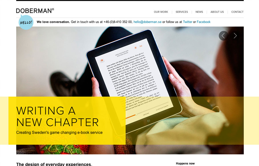
I really dig the hierarchy designed into this home page. The large image/slideshow is nice with nice details and you get t focus on that, with simple messages and then as you scroll down the info gets more densely populated and then eventually just some basic about and contact info. Basically each page of the site has been treated with this attention to visual and information hierarchy, which is a huge detail and one we can all take lessons from.


The Call to Action, Revisited
The Call to Action hasn’t changed in a decade, but the bar has. A fresh look at prominence, copy, mobile tap targets, and accessibility, with lessons from three major design systems.


0 Comments