Submitted by Brad Madigan, @bmadigan. Designer & Developer.
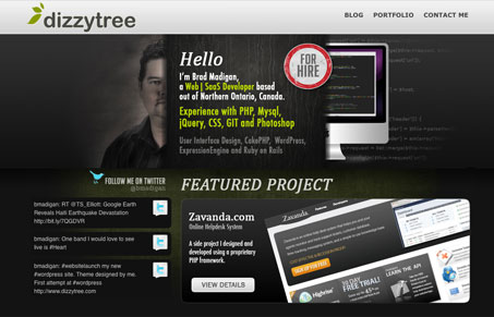
I love personal/professional websites like this one. Places where web professionals put up work samples and blog posts side by side. Often they are projects that are worked on just for fun, it normally shows in a good way. There’s some interesting design things going on with this design, the half face half computer imagery at the top of the site is a nice little visual thought. I think the typography could stand to be simplified a bit on the overall layout, there feels like there may be too much going on. Overall though, pretty nice looking site.


He looks like he’s leering at me from behind a corner. Like some sort of pervert.
Aw come on John, keep it constructive man.
sorry 🙁
It captures the essence of the darkest corner of a parking lot outside a seedy bar at 2am. Not unlike a place you’d expect to be murdered.
😀
Joking aside, I’m a little confused by the design. The homepage uses 4 different typefaces. Way too many, if you ask me. Then when you click into the site, all the texture that was introduced on the homepage is suddenly gone.
One thing I noticed. There seems to be some javascript controlling the color of selected text. IT’S BLOOD RED. I’m just saying, Gene…I’m just saying.
You’re too much man. I enjoy reading your feedback though.
I mean, I kinda agree with John on the creepy factor of the site – and the amount of fonts used. The styles of the fonts also conflict when you look at the difference between ‘Dizzytree’ and ‘Who am I?’