disqus.com

disquscom

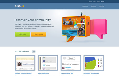
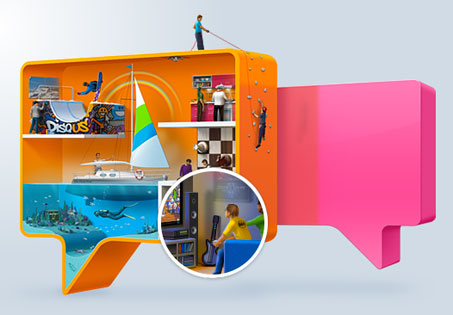
The website for disqus is clean and well organized. I like the the placement for the call(s) to action “sign up” & “learn more”, while there’s two of them treated equally visually, they are very centrally placed on the page. Then next to that is a really neat interactive piece. The magnifying glass effect over the illustration is very cool and sets a really nice tone for the website and service.

disqus-detail

The signup form is also well designed, it’s as simple as it can be field wise and succinctly walks you through what disqus needs from you in order for you to start using it.

0 Comments

Submit a Comment

Your email address will not be published. Required fields are marked *

News & Articles

Looking Fast: The Art of Website Speed Perception

Looking Fast: The Art of Website Speed Perception

In the web world, technical speed and user perception matter. By improving design for a faster appearance, you boost conversions and stand out online. Speed isn’t just loading time; it’s perception.

Designing for Errors: Creating User-Friendly Contingency Plans

Designing for Errors: Creating User-Friendly Contingency Plans

Contingency Design hinges on empathy, understanding user frustration, and transforming errors into positive impressions. By embracing these principles, you enhance user experiences, retain customers, and boost revenue in the competitive digital landscap