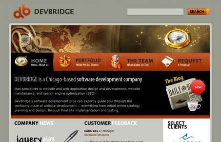
I like the top half of the homepage the most. I like the 4 big button like links instead of a traditional looking navigation design. This keeps it really simple and puts what people want to see up front. I love how each page is slightly different or different enough to keep me interested. I’m not sure what the deal is (or meaning of) with the background image in the footer but it looks well done.
Looking Fast: The Art of Website Speed Perception
In the web world, technical speed and user perception matter. By improving design for a faster appearance, you boost conversions and stand out online. Speed isn’t just loading time; it’s perception.


i agree, the navigation is nice solution. but the graphical elements are out there… you have an old map, a magical pirate ship & compass, and 2.0 icons.. i dont know. it doesn’t seem like a coherent theme to me. and why even have the header map graphic on subpages if it is only going to be 50px tall?
@George Check the footer too. Gotta love a pirate ship. 🙂