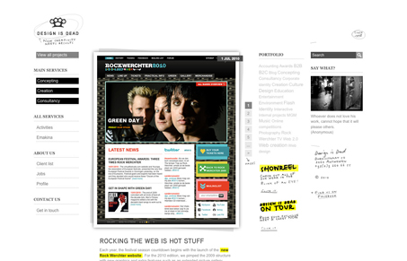
The fixed “everything but content” aspect to this layout is surprising and that’s a good thing. You totally don’t expect the page to behave like it does when you start scrolling – I love that. Some of the elements are a tad on the small side for me personally, I’m not normally a fan of small(ish) type on a web page. I really dig the line work, the illustrative quality to the mouse over on the main images and the hand styled type all around the site is very nice.
Also, having your logo be a set of brass knuckles is pretty awesome… just sayin’.


I hate this
Care to elaborate?
I *really* hate it.
As a note to UMS readers: We love your feedback, I mean we LOVE IT! But we would really appreciate it if it was constructive. If you don’t like something that’s totally fine, but if all you’ve got is “I hate it” that’s not helpful at all.
So thanks for the comment, but please keep it constructive otherwise we’ll remove the comments.
Thanks everybody! I know you’ll understand our position on this.
-Gene