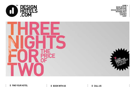
I love the clean, black and white feel of this site and having the images be the only real color on the page. I like the visual rhythm in the layout and elements as you scroll down the page, I think the navigation in the top right is kind of small for it to be stacked and so many letters like it is, the words just run together and are hard to scan. I also think that while the almost totally alien shapes of the form elements are really cool looking they wind up being confusing and make me really have to think about the form too much. Overall this site has a really nice vibe to it.
Looking Fast: The Art of Website Speed Perception
In the web world, technical speed and user perception matter. By improving design for a faster appearance, you boost conversions and stand out online. Speed isn’t just loading time; it’s perception.


0 Comments