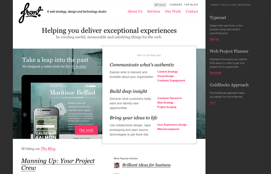
I really like the way the layout of the homepage for designbyfront.com has been executed. The “badges” on the far right of the page are placed well and somehow don’t get missed like banner ads would. Then there’s the general layout of the center area, I really dig how the “hire us to help you” section/links are placed. It’s super easy to see/read and react to. Then the fixed footer that is revealed as you scroll the rest of the page up is a superb experience point that I just enjoyed discovering. Really well done home page.


The Call to Action, Revisited
The Call to Action hasn’t changed in a decade, but the bar has. A fresh look at prominence, copy, mobile tap targets, and accessibility, with lessons from three major design systems.


0 Comments