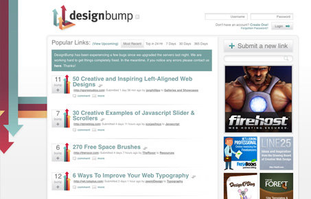
The new(ish) design for designbump.com, there’s a great article cover the reasoning behind all the design on spoongraphics.co.uk.
I think it’s a great redesign, the new branding is crisp and memorable and the site design is very clean and simple to use. Everything is in it’s place and feels like it has purpose. I absolutely love the switch to only “up voting” that’s really smart and keeps the tone positive. The advertising has been tamed in a good way. I would like to see that “submit a new link” button more obvious, it just feels kind of hidden. The thing I like most is how all the arrows in the design point you inward towards the content, that’s really clever and I can greatly appreciate the thought that was put into laying out this website design.


0 Comments