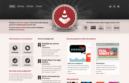
The Internet Guys or Internet Boys (depending on which translator you’re using) have a really nice looking site. It’s got a soft feel and is nicely balanced. One I started poking around a bit more, I found some really neat little details. I like how the content to the left and right of their logo stays on each page – it quickly defines who they are and what they’re capable of. I didn’t notice it at first, but there’s a map at the bottom of each page. Subconsciously, I figured it was part of an open window behind my browser and didn’t visually relate it to the website. Once I realized it was part of the page, I still am quite unsure about its necessity – especially on the Contact Page. I like the overall layout structure that they carry throughout the rest of the site, and I think the Portfolio page is smartly done. The thumbnails on the left side scroll down while the right “featured” area remains fixed and also has browse controls that when clicked through, highlight the corresponding thumbnail. It’s a nice touch, and an effective use of the 2 columned approach. Lastly, I like how they utilize the Contact page to be more than a form and a map. They’ve included recent blog posts, as well as recent Tweets. Both are outlets in which to connect with the company so it makes sense for them to be neatly packaged in this page as well.


0 Comments