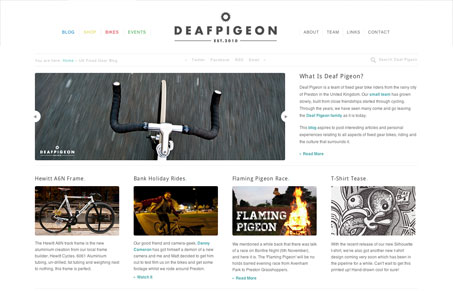
deafpigeon.co.uk is a really nice blog about fixed gear bikes and related bike stuff. Its a great combination of photography and understated design. I like the site’s ‘back to basics’ approach to organizing and presenting content. Everything is clearly labeled and structured and the little touches shine above a solid structure. Take, for instance, the horizontal main site navigation. Barring the obvious accessibility issues of using nothing but color to emphasize hierarchy, the eight main pages are separated into two categories: the pages for content (colored links) and the pages for information about deadpigeon and its contributors. Its a simple but elegant solution to demarcation between equally important but different content. Even though this little touch of rainbow color is minimal, in the context of deadpigeon’s largly monochromatic design scheme, it is a nice high point that doesn’t distract from the content.


0 Comments