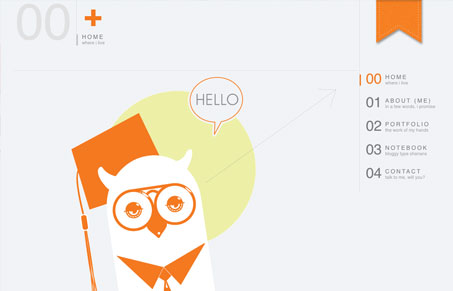
I love the minimalism in this design. The simple grays and orange color selection. However, I do think the number system used alongside the navigation is a little unnecessary and can lend to making this beautifully simple website design more complex than it needs to be.
Glassmorphism: The Transparent Design Trend That Refuses to Fade
Glassmorphism brings transparency, depth, and light back into modern UI. Learn how this “frosted glass” design trend enhances hierarchy, focus, and atmosphere, plus how to implement it in CSS responsibly.


0 Comments