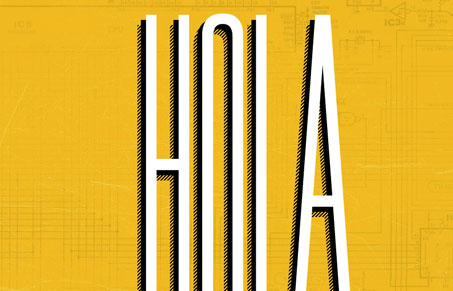
I like this single page scroller because it uses the scrolling to some nice effectiveness. The large ‘HOLLA’ & the background imagery on the top portion or home page of this site looks neat and is plenty eye catching. Then as you scroll down you see that the logo and main nav become fixed in place, again that’s a nice use to give you a fun little experience going through the content. This site isn’t very deep content or concept wise but it does keep you interested visually and that’s enough for me here. Good work!


Hello UnmatchedStyle!
I’m back after an extended hiatus! I don’t really know how I feel about this site. On one hand it functions nicely. I love the smooth scroll and how the left hand navigation stays static, although I felt he could have used color more to his advantage. I loved the Yellow but felt bombarded by it as well. I dunno, there was no place where I naturally wanted to click – I kind of just explored, but maybe that was the point? Not sure, which is never good.
Glad to have you back Isaac!
It is a lot of yellow indeed, I like it – yellow is the new orange maybe?