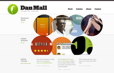
While the home page on Dan Mall’s new site is very clean and minimal with just enough interactivity to make it interesting, the ‘Work’ section is where the site really shines. Each portfolio piece has a really nice bit of chunky text at the top, with left/right arrows for easy navigation. As you scroll down the work is presented in a collage of sorts, followed by nice write up. The layout almost has a magazine (a well designed one) feel. I like it when there is obviously a lot of thought and effort into presenting one’s work and this site delivers on that.


0 Comments