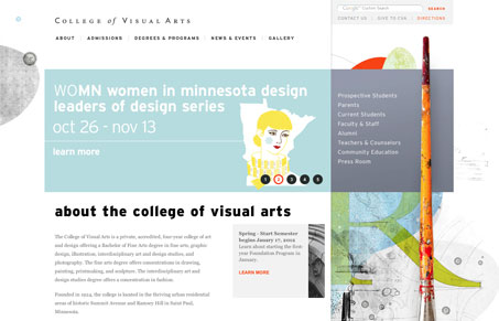
I really like this site. Aesthetically it’s everything it should be – considering it’s an art school site. The layout and typography reminds me of a gallery brochure or poster series. The whole site seems to be organized in an intuitive way despite looking anything but traditional. One small thing that’s a bit confusing is that in some instances, headings are the same color and similar size/style as hyperlinks and CTAs. It’s not the case for the majority, though so I don’t think it’s that big of a deal. Overall it’s nice to see an offline feel represented in this site while still maintaining a modern look.


0 Comments