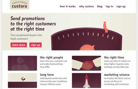
Custora.com has a beautiful color palette. The soft browns and creams are very different from many of the sites that we review. Most designers these days seem to favor achromatics or bright, highly saturated palettes. custora.com’s colors are rich and sophisticated and pair well with the pink accents throughout. The homepage best handles the balance between color and typography. I feel that the the subpages (for instance, the how it works page) lose a little of their charm by eliminating the desaturated purple and having gigantic text. I think these pages suffer from having too little content. The blog is a great example of the look when applied to a larger amount of content. It feels much more balanced and sophisticated. The soft colors and minimal application of highlights is very nice.
Looking Fast: The Art of Website Speed Perception
In the web world, technical speed and user perception matter. By improving design for a faster appearance, you boost conversions and stand out online. Speed isn’t just loading time; it’s perception.


0 Comments