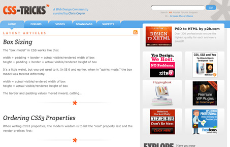
Recent redesign of Chris Coyier’s website css-tricks.com is a top-notch rework of an already classic website. There’s really a lot going on with this design, while being majorly simplified from the previous iteration. From the slightly responsive/liquid design to the interactions this website really is a well oiled piece of work.
I really like the design being centered around a simple two column layout and really featuring the blog posts like it does. There’s a pretty vibrant community around css-tricks.com, so putting that first and foremost is a strong move to simplify. I love it!


I LOVE this site. Not only for the sweet creative, but the usability. I have learned so much about CSS / JQuery / WordPress because of this site.
Awesome work.
Chris Coyier is the man, right?
Aw shucks fellas, glad you like it. In the launch post I actually talked about how a site like this will never make it into a gallery because of (mostly) the ads. You showed me =)
For me, good design is as much about function and intended experience as it is about beautiful graphics. Your site looks great and I think the new design is a vast improvement into getting me into the content as fast as possible. Ads be damned man!