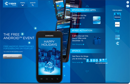
My first impression was that this is a different and almost strange layout. I thought “Where am I going to look first?” But very quickly I found myself engaging with the site in a way that somehow felt natural. The compartmentalization (dang that’s a long word) works and kind of mimics a mobile app environment which is neat. The color scheme is mostly monochrome but has a nice layered depth. The vertical parallax adds a nice touch too. The product results page seems disjointed from the rest of the site but overall there are some nice details considered here.
Looking Fast: The Art of Website Speed Perception
In the web world, technical speed and user perception matter. By improving design for a faster appearance, you boost conversions and stand out online. Speed isn’t just loading time; it’s perception.


0 Comments