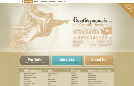
Submitted by Aaron Payne, @creativepayne. Role: Designer & Developer.
The website plays loosely off of fifties style posters.
The overall look is supposed to be friendly but not overly to the point of looking unprofessional.
I wanted to create a more illustrative look but use a very clean and simple frame so that the graphics and illustrations do not distract from the point of the site.
I love the vibe of this website design. The coloring and textures are cool, it reminds me of nicely made corrugated cardboard somehow. Like something you’d get wrapped around a starbucks coffee. Maybe I just need coffee right now? Seriously though, the illustration and coloring/texture work really well together and also leave the site looking rather unique. One thing I’d like to see is the main nav at the very top of the site be larger and more noticeable. It feels a bit hidden up there all alone on the page(s).


0 Comments