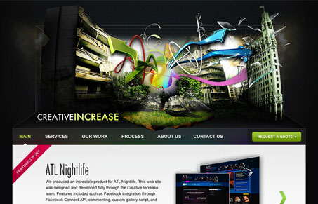
This will seem contradictory, but you be the judge of me: I think this site looks great, I like the crazy graphic, the 3D like levels worked in and the typography. I do think the main header graphic is out of control and it’s odd how as you use the navigation the designers of the site even make you skip it by anchoring the links below it. Good looking site, yet it’s a conundrum at the same time.
Looking Fast: The Art of Website Speed Perception
In the web world, technical speed and user perception matter. By improving design for a faster appearance, you boost conversions and stand out online. Speed isn’t just loading time; it’s perception.


this looks like an explosion at the cliche factory