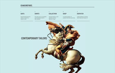
crane-brothers.com is a lovely site that puts imagery to great use. It is incredibly tasteful by design and has few flashy tech related bells and whistles. I think this is a great strategy for a company that revolves around the traditional crafting of fine clothing and accessories for men. Stark and clean, the site is both understated and very tight. If this site were a a suit, it’d be single breasted , double vented and strongly tapered, with a bright pocket square.
In other words, tasteful and memorable.


I’m not sure about this one, there is a time and place for modernism. In this case it does nothing for me. A bit stale and boring. Looks like every other site on siteinspire, sorry
That may be Phillip, you’re of course entitled to your opinions. I think Giovanni’s right here though, the site is for a company that tailors suits and i’d agree it’s the almost perfect design style for who those guys are. Regardless of how it compares to other sites in *ahem* other galleries.
i’d agree that it feels “well tailored” down to those transitions.
and if they can get napoleon as a sponsor they must be good.